
|
Teresa Connolly
Open University, UK
Open educational resources (OER) can be described in numerous ways (Creative Commons, 2012). In this visualization based context, however, OER can be defined as
…teaching, learning and research resources that reside in the public domain or have been released under an intellectual property license that permits their free use or re-purposing by others. Open educational resources include full courses, course materials, modules, textbooks, streaming videos, tests, software, and any other tools, materials or techniques used to support access to knowledge. (Hewlett Foundation, 2007)
This definition emphasizes some of the aspects highlighted in this article, namely that an OER approach has also been taken to capture and visualize OER materials. In addition reference is made to the forthcoming paper, “How Diagrams Aid Teaching and Learning in STEM Subjects as Exemplified by the Teaching and Learning of Systems Thinking in Practice” (Lane, 2012, in press), which outlines how the educational process often involves a mediated discourse between teachers and learners to aid sense or meaning for both parties.
Keywords: Open education resources; visualization mapping
OER have become more widely available through a variety of digital platforms: dedicated repositories, referatories, and numerous, sometimes bespoke, search engines. When seeking OER, however, it is quite noticeable that the presentation of much material is provided as written descriptions with few visual clues or signposts to aid navigation or indeed the discovery of relevant or appropriate resources. Nevertheless, many OER may include media rich assets, for example, video, flash animations that are not necessarily always immediately obvious to the end user. Indeed it could be argued that few of the largest or most popular OER repositories present their wares in any other way than as lists or indexes of stuff. There are many examples of this, for instance, the OpenCourseWare offered by MIT (MIT Open Courseware, n.d.) or indeed the OER listed at OpenLearn (The Open University, n.d.). One general exception to this rule, however, is the adoption of tag clouds by many repositories where the scale of the “words” indicates the popularity of the resource or OER topic and, as such, could be deemed to be offering visual clues to the attractiveness of those OER materials. A good example of this approach can be seen at the JISC Info Toolkit (n.d.).
This article sets out to examine how a variety of visualization mapping methods have been realized in a range of OER scenarios. It examines four specific issues: firstly considering how visualization mapping can be employed at a strategic macro level in terms of OER institutional planning; secondly outlining how visualization mapping can be employed at the meso level concentrating on the design and production of OER materials; thirdly, how visualization mapping can be used at the micro level as a navigating interface to OER assets; and, fourthly, how this can also enable learners and researchers to make sense of published OER materials.
Most examples are drawn from the OpenLearn OER project with some other illustrations, for context, from other OER projects. Whilst the premise of the article is to highlight the visualization mapping methods, a number of examples have been from materials repurposed using the Compendium knowledge mapping software. Compendium is one of many such software packages that are freely available to enable the visualization of knowledge, information, or subjects of interest; it is available from the Compendium Web site for The Open University UK (n.d.). Thus Compendium is a software tool providing a flexible visual interface for managing the connections between information and ideas.
A good example of how visualization-mapping methods have been successfully employed both manually and digitally can be seen in the Multilingual Open Resources for Independent Learning (MORIL) project funded by the Hewlett Foundation via and run by the European Association for Distance Teaching Universities (EADTU) in 2008. Overall the MORIL project wanted to establish and provide a gateway to university education for a broader range of target groups, facilitate international learning experiences, brand open and distance teaching universities, and gain enhanced experience with OER.
One part of the MORIL project thus set out to establish how EADTU members were currently using or considering developing and delivering OER in their institutions (Okada, Connolly, & Lane, 2010). The Okada et al. paper introduces a methodology that integrates ideas for collective sensemaking through knowledge maps based on a designated template or framework. Ostensibly the objective of this work was to identify some of the benefits and challenges that may be faced when using a knowledge mapping tool to help different groups gain a common understanding of issues around a key opportunity. With respect to visualization mapping techniques this gave the participants, representing a diverse group of EADTU membership, for example, both dedicated “open” universities and national associations of open and distance learning (ODL) institutions, the prospect of not only presenting (by drawing) their current OER landscape but also understanding institutional OER strategies from across Europe using a visual medium.
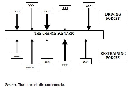
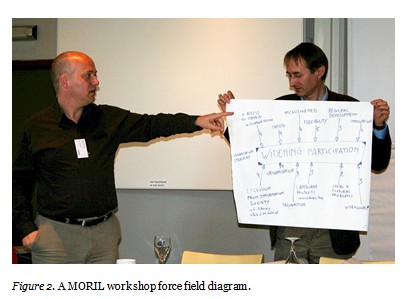
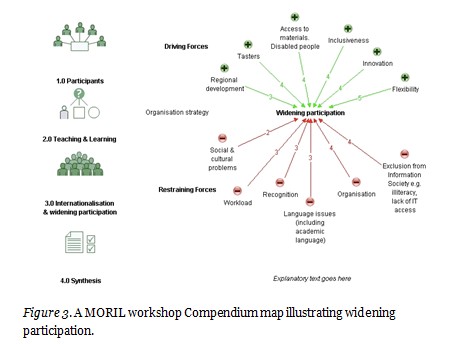
In order to facilitate and capture the information gained from this process, a series of workshops was arranged. During each workshop, the technique of force field mapping (Lewin, 1951) was employed to help participants quantify and then visualize the driving and restricting factors that were encouraging as well as hindering such potential OER developments in the EADTU institutions. Workshop participants were divided into four groups and asked to create a force field diagram (see Figure 1 for an example of the template) to quantify these significant push/pull factors (driving/restraining). Each group had to negotiate the strength of the factors as well as appoint a scribe to draw the diagram. At the end of the workshop, the facilitator synthesized these collaboratively produced diagrams into one visualization “map”. After the event the force field diagrams and synthesized visualization map were captured digitally and then re-presented using the knowledge mapping software Compendium. The resulting digital visualization maps were made available for further consultation via the OER study unit “EADTU Multilingual Open Resources for Independent Learning” located in the LabSpace area of OpenLearn (n.d.). LabSpace is the dedicated Web site of the OpenLearn project that enables users to upload, remix, and repurpose OER materials. The MORIL maps were stored in LabSpace as it was accessible to all participants and it offered an excellent medium to disseminate the resulting maps.
Three workshops were organized, in different locations, to achieve the MORIL project’s macro aim of wanting to establish and provide a gateway to university education for a broader range of target groups, facilitate international learning experiences using OER, and so on. Each workshop, held in different countries, therefore, covered specific topics:
As noted earlier the manual visualization mapping methods used for these workshops involved force field diagrams (see Figure 2 for an output example). These were created collaboratively for each group in the workshops, the premise being that all participants would understand the strategic theme of the OER-based event. As also noted earlier these force field diagrams were later digitized and re-presented using the Compendium mapping software (see example in Figure 3), which enabled further linkages and potential additional analysis of the contents to take place.
Charting the life story of an OER can be quite challenging as the end product may be varied both in its conceptual design as well as in the ensuing production processes that were required to deliver it. Visualization mapping techniques in this context can help with quantifying these processes by charting that journey (Connolly, 2008) through summarizing, simplifying, and recording it in a relatively straightforward manner. Two examples of this type of diagramming are described here: firstly the creation of a series of flowcharts to capture the production processes of the OpenLearn project and, secondly, some specific uses of the bespoke Compendium LD package, that is Compendium adapted specifically for use in learning design (LD) by way of a different example. The latter software was used to describe the learning design of particular Open University courses and also some OpenLearn study units.
The OpenLearn project, or Open Content Initiative as it was originally called, was established in 2006. A successful bid to the Hewlett Foundation enabled the setting up of a dedicated project team in the Open University, UK that was tasked with the creation of a variety of OER. Initially two OpenLearn Web sites were established, LearningSpace and LabSpace, that effectively enabled the team to present different types and styles of OER materials as well as use associated communication tools. LearningSpace is aimed mainly at learners wanting to study OER and LabSpace is mainly for educators wanting to create or repurpose OER (see McAndrew et al., 2009, for more details).
OpenLearn OER are reproduced from original self study distance learning materials developed at the Open University and are drawn from a vast academic catalogue of resources. Samples of these “chunks” or “units” of these original course materials were offered to the OpenLearn project in a variety of formats: Both paper based and digital, they often comprised of text, images, audio, and video as well as separate book based readings or related journal papers. The majority of such materials, however, were self contained and generally comprised of learning outcomes, subject content, self-assessment, as well as related references and acknowledgements. They were produced, therefore, keeping to their original integrity.
Thus these units fitted what has previously been described as the integrity model of production (full details in Lane, 2008). In brief the content required limited transformation from its original form to that of an appropriate OER delivery. By contrast, however, a number of non-standard (so-called “remix” or “remake” models) units of materials were also offered to the OpenLearn project. These varied in shape and size as well as format. They ranged from software-based solutions (e.g., computer programs, java applets) through materials containing extensive video/DVD footage to collections of subject-based resources that had been presented previously via a CD or DVD platform (Connolly, 2008). It is the latter potential OER materials that invited another application of visualization mapping techniques to be explored and developed.
The OpenLearn project established a relatively stable production process that centered on the creation of OER based on the integrity model (see Lane et al. 2009 for full detail) and summarized visually in Figure 4 that shows an overview of this integrity production process presented as a production flowchart. In brief the process followed a pattern whereby original course materials were offered to the OpenLearn project from faculties; they were assessed in pedagogical terms by academics, handed over to the media production team, and then “processed” to fit an existing XML template that allowed the subject content to be rendered into HTML pages that were then delivered as OER on the OpenLearn Web sites.
Initially this OpenLearn OER production process was captured in the form of a series of three Microsoft Visio flowcharts (see Figure 4 that illustrates this idea: Stage 1 only). Each flowchart represented a significant stage of the production process:
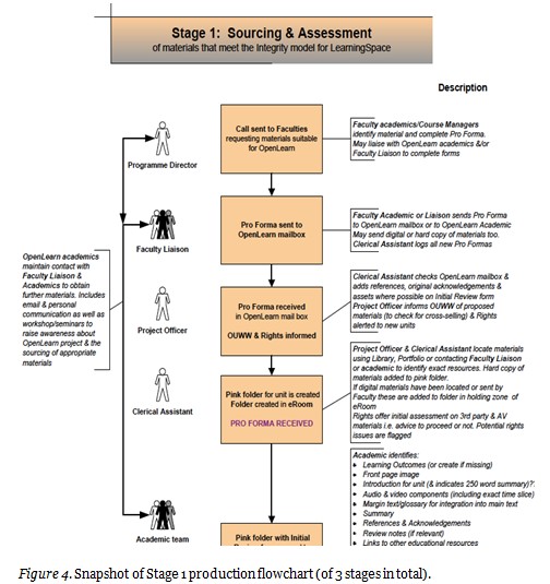
An academic working with OpenLearn created the flowcharts based on personal and, via interviews with colleagues, confirmed working knowledge of the project (see Schuwer et al., 2011 and OU Knowledge Network, n.d., for further details and for the actual flowchart diagrams). Procedures for each of the stages of the production process had been established between April 2006-May 2007. These procedures ensured that the original materials were carefully assessed academically as well as technically and thus (ultimately) presented as cohesive OER. This also included a thorough rights clearance process in addition to the implicit academic input and media production processes. Technical issues were also considered and if materials did not “fit” the integrity model of production they were labelled as such and did not complete the integrity production process.
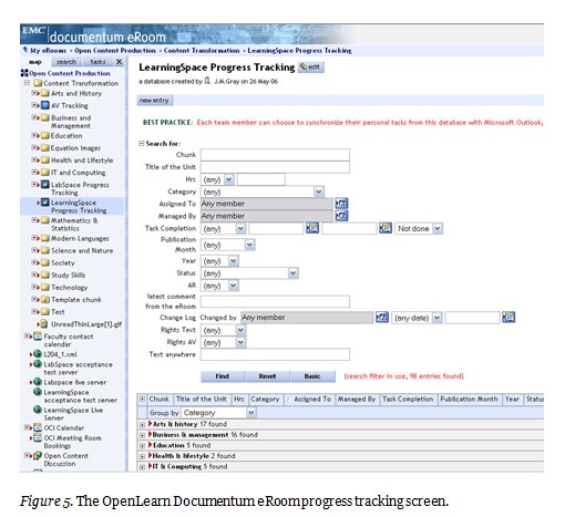
Information about each stage of the production process and any significant notes relevant to the project, to groups of materials, or units were also recorded electronically in the Documentum eRoom – an electronic document storage database accessible to all members of the OpenLearn team. This facility produced an overview of the production process (presented as progress tracking, see Figure 5) as well as recording details related to the life story of individual units. The latter, however, was presented as a series of indexes or lists that proved to be difficult to interpret for the uninitiated. The development of the OpenLearn Production flowchart took such processes into consideration, alongside information gained from colleagues, and represented them in a diagrammatic form that was simpler to understand (see Figure 4 by way of contrast to Figure 5).
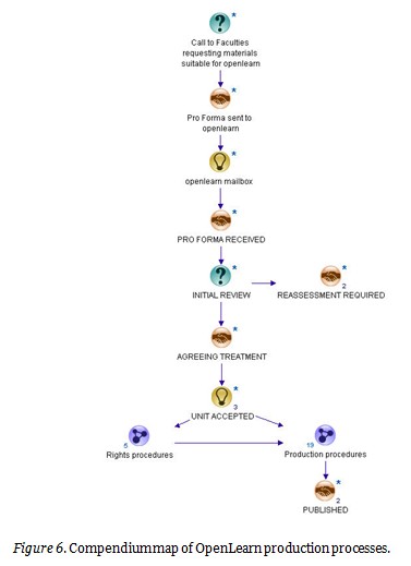
At a later stage the OpenLearn production flowchart was further simplified, in diagrammatic terms, and re-presented using the Compendium knowledge mapping software available from within the project itself. An example of this simpler diagram can be seen in Figure 6. In essence the Compendium software offered hyperlinking between different elements within dynamic linking of a complex set of processes and also a home grown demonstration of how visualization mapping techniques can be applied to OER developments. Compendium uses a series of basic icons that can be employed to represent a variety of meanings or interpretations. In Figure 6, for example, the “Question mark” icon is used to represent a request or dialogue whereas the “Handshaking” icon is used to represent an agreement or understanding stage of the process. This “Light bulb” icon indicates a decision or choice of route and the final icon, with three dots joined together, indicates that a sub-map or set of processes is available.
It is interesting at this point to contrast the OpenLearn flowchart (see Figure 5) and the OpenLearn production process map (see Figure 6) with similar visualization approaches developed elsewhere. Two projects appear to have taken a similar visual presentation of their methodology in designing, developing, and planning their OER materials, namely the dScribe and the CORRE projects. These will now be briefly described in order to situate the use of visualization techniques as an approach to presenting OER production methodologies.
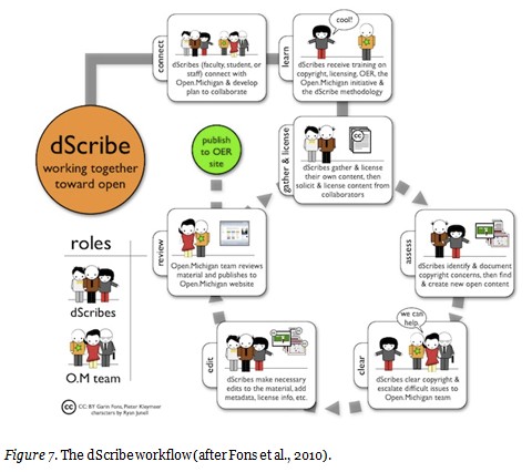
The dScribe project was developed by the Open Michigan team (Park, 2009). “dScribe” is short for
digital and distributed scribes and as a method is based on a participatory and collaborative model for creating open content. In effect dScribe brings together enrolled students, staff, faculty, and self-motivated learners to work together toward the common goal of creating content that is openly licensed and available to the world.
Figure 7 illustrates the project’s workflow processes and it is presented as a visualization. Again it uses simple icons to represent various production stages.
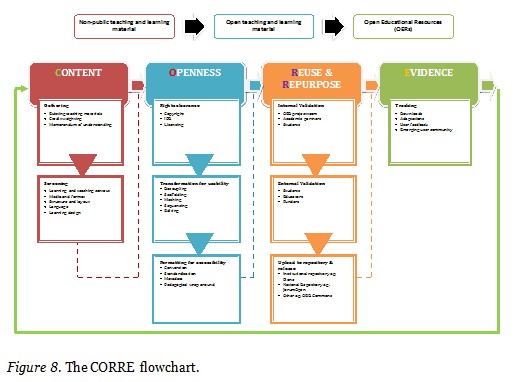
The second project is known as Content, Openness, Reuse and Repurpose, Evidence (CORRE) and it is also an approach to creating an integrated workflow framework that has been developed to transform existing materials into OER. It has four main stages, each defined by a set of criteria matched to indicative evidence. Once again this has been visualised and is illustrated in Figure 8. It uses colour blocks rather than icons to represent its distinct stages of production/workflow.
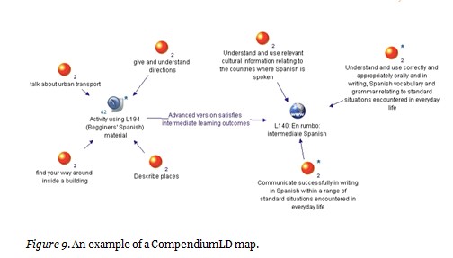
The second example at the meso level of employing visualization mapping techniques in the broader area of OER can be seen in the application of a bespoke version of the Compendium software developed for the Institute of Educational Technology (IET) at the Open University known as Compendium LD. This version of the software was developed specifically to support the area of learning design as a tool to support lecturers, teachers, and others involved in education to help them articulate their ideas and map out designs or learning sequences. Effectively Compendium LD provides a set of unique icons that represent the perceived components of learning activities; these are presented as a series of bespoke icons alongside the original or master Compendium icon images and are presented in groups as “stencils” in the form of a
The example shown in Figure 9 demonstrates how Compendium LD, and its bespoke learning design icons, has been used to create a visual map that models adaptations of OER materials. This is an example of in what way a potential design illustrating how existing OER materials can be included in an activity structure that caters for learners with different levels of skill and knowledge. The illustration in Figure 9 is based upon contrasting existing Open University Spanish materials from two courses: L194 and L140. Visualization mapping in this instance has enabled the two course teams to explore the current learning design of their materials and adapt them accordingly with respect to the incorporation of further OER materials.
The orange icon in Compendium LD represents an idea whilst the blue/grey icon represents an activity, which may, or may not, be linked to other layers of the map. The remaining icon used in Figure 9 represents a link to the Internet and, in this case, a link to a related L140 intermediate Spanish language resource. For further details and additional examples see Compendium LD (n.d.) in action and also the OU Learning Design Initiative (OULDI) (2012) Web site.
The third example of how visualizing mapping methods can be applied to OER is a description of using the maps as navigating interfaces to groups of OER assets. In this scenario the illustrations used will be based on two OpenLearn OER study units which, as previously mentioned, formed a small percentage of the materials offered to OpenLearn that did not fit into the “typical” integrity model category described above. These non-integrity Open University materials took many other forms but essentially were labeled supplementary materials (an OU term that describes extra materials that add value to a course but are not necessarily integrated directly into it). Some examples of potential OER sources would be materials such as CDs and DVDs, software, and applets.
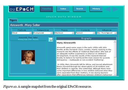
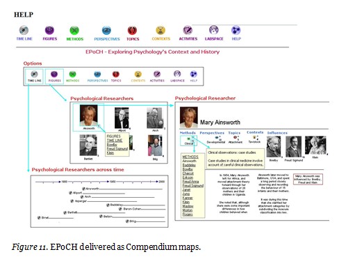
An illustration of the first non-integrity or unconventional OER type materials is a CD based resource, offered by the Faculty of Social Sciences, called Exploring Psychology’s Context and History (EPoCH). This was a substantial content-based resource that presented both biographical details of in excess of 100 psychologists as well as descriptions and links between psychology methods, contexts, perspectives, and topics. It was originally offered as a supplement to the Open University course DSE212 Exploring Psychology but withdrawn from the course in 2006 as it did not meet the accessibility requirements of the (then) UK National Special Educational Needs and Disability Act (SENDA) legislation that has now been superseded by the Disabilities Discrimination Act (DDA). Essentially the EPoCH CD contained a substantial set of resources containing extensive psychology based subject information. Figure 10 represents an illustration of the original resource whilst Figure 11 shows the Compendium “visual” map version of the same materials.
Essentially visualization mapping techniques offered an excellent method in this case study to act as a navigation interface for what was a complex collection of underlying assets. It also emerged that Compendium offered a more dynamic environment for re-presenting these types of resources. Additional linkages, for example, were made using the hyperlink facilities offered in Compendium. It should, however, be noted that the audio and video contents of the original EPoCH CD were not captured in the new Compendium maps (it was technically possible but financially not feasible because of copyright issues). It can be noted, however, that the challenge of copyright was resolved in the subsequent (second) case study, that focused on Project Management, described later in this section.
A number of factors influenced how the EPoCH assets could be presented as a navigable OER map. This was primarily because it contained content that was akin to an encyclopedia or a family tree (of psychology/psychologists), easily accessible in its original format (images, word files were available), and fully referenced and acknowledged (a comprehensive permissions list existed).
Conversely the EPoCH CD resource was not accompanied by any specific learning materials, that is, a guided pathway of learning through the resource. Whilst this was not a barrier to its use as an OER map it was recognized that such a resource would be enhanced by the addition of some structured learning materials particularly for those unfamiliar with the subject content and/or the use of (Compendium) knowledge maps. Consequently a structured OER study unit was created to guide the learner through the use of the new EPoCH OER map.
In essence varied source materials (text, images) were captured and represented in the form of a navigable knowledge map (compare the presentation of Figure 10 and 11). The dynamic nature of the software also allowed many further enhancements (in terms of navigation and presentation) to be made to the original materials. From a visualization point of view, access to the materials was certainly perceived to be more pleasing and, indeed, easier on the eye in terms of understanding how to use the resource too. Whilst there was no specific research carried out to substantiate this aspect there were a number of positive feedback responses from both the original course team authors as well as those who then subsequently recommended the new version of EPoCH to current DSE212 Exploring Psychology students. These maps can be accessed directly via the associated OER study unit known as “EPOCH Psychology history timeline” directly at EPOC (n.d.)
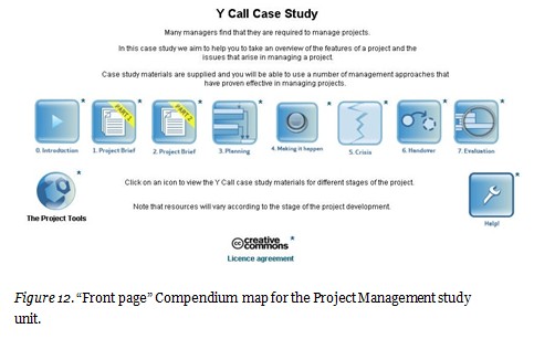
The second case study of how mapping methods can enhance the navigation of OER assets focuses on an OpenLearn study unit called Project Management. Once again it required the re-organization of a complex set of original OU teaching materials that delivered large amounts of subject-based information. Similarly to EPoCH, the original Project Management case study materials were supplied internally to the OpenLearn project in the form of a bespoke CD ROM containing the case study resources, along with extensive associated project management text-based teaching materials. The latter were originally delivered in a print form.
These materials, however, were originally developed by academics from the OU’s Business School (OUBS) in conjunction with colleagues in the BBC as part of a practice-centered approach to management education (Fenton-O’Creevy, et al., 2006). They had been previously fully integrated into the MBA program of the OUBS. Both the teaching materials and the CD ROM case study resources had been carefully crafted to match the defined learning design and practice-centered pedagogy of the MBA program.
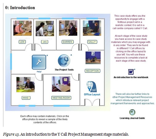
The Project Management OER, which was reconstructed using Compendium (see Figure 12 for an illustration of the “front page”), comprises a set of maps that present an integrated overview of seven offices and associated staff of the fictitious call-center company called Y Call. The main goal of this OER study unit is to develop a business assignment using a particular Project Management approach with the associated Y Call assets that are presented in the various OER maps. Again the Compendium maps can be accessed directly via the associated study unit B713_PM (Compendium, n.d.). The basic Compendium icons were not used for this project and a set of bespoke images were developed to reflect the seven stages of Project Management as well as represent the Project Tools and Help sections.
There are seven stages to the Project management case study. The associated assets (described below) are presented within the relevant offices of the call center. The navigable maps are based on Y Call’s office layout and tailored to each of the seven potential stages of the Project Management assignment. Figure 13 illustrates the Stage 0 introductory map and shows the use of photographs to clarify the relevant staff, their office locations, and the availability of project tools. Each office photo is a “clickable” Compendium icon and selecting any one of them takes the learner into the office revealing further, often media rich, associated assets. The latter vary from office to office and indeed from stage to stage. They take the form of email exchanges, audio messages from answer-phones, short video diaries, or presentations or staff notes.
As previously mentioned an additional visual aspect of note in this transformation of the original OUBS course materials into a series of dynamic and navigable OER maps, however, was the commissioning as well as use of bespoke Compendium icons to aid the navigation of the assets/resources within the Project Management maps. Figure 14, for example, illustrates the particular icons created to represent the distinct project tools. Each icon represents a snapshot or representation of the associated project tool in a visual form.
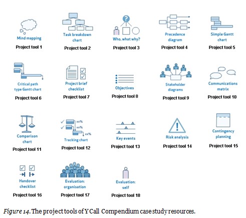
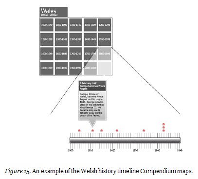
The development of this bespoke set of visual icons proved to be an invaluable resource as subsequently they were available for reuse elsewhere, invoking the Creative Commons license, such as in further OpenLearn OER projects and in other OU based research projects, for example, the EU funded ICOPER (2012) and OpenScout (2012) projects. Indeed the same can be said for the templates developed for both the EPoCH and Project Management maps also – they lent themselves to repurposing too. In this respect some of the mapping and navigation ideas were also reused in an associated OpenLearn OER unit “Welsh History and its Sources” (See Figure 15 for an illustration of this resource and for access to it, see Welsh History Timeline, n.d.)
The premise of the associated Welsh history timeline was to visualize and map a series of historical events between 1150 and 2010. These events were drawn from the original Open University course “Small Country, Big History: Themes in the History of Wales” and along with other relevant materials offered as a potential OER unit to the OpenLearn project. The Welsh history timeline took the form of a checkerboard map layout with approximately 50-year blocks of historical events being displayed as is illustrated in Figure 15.
A further set of visualization mapping approaches had been explored within the OpenLearn team’s research report about the project (see McAndrew et al., 2009). These ranged from the use of tools for mapping and talking about research to using the Compendium knowledge mapping software to understand learner narratives. Underpinning this idea was the ability to make sense of such tools in terms of using them to apply/react to action research and activity theory. In the context of the theme of this article, however, one can also see that this work was an application of visual mapping that enhanced these research efforts in terms of offering not only a different view but also, as identified in the report, new ways of thinking, as well as analyzing and describing the research in question. It appeared also that some individual users created their own Compendium maps, for example, one relating to Charles Darwin’s natural selection that can be seen at Natural Selection (n.d.). Original Compendium icons were used to represent the Darwinian theory of natural selection in the form of a visual knowledge map.
In this research aspect of OpenLearn the adoption of visualization mapping techniques appeared, once again, to arise out of the opportunity of relevant software (Compendium) not only being actively offered within the actual project but also being a suitable medium to enhance the research and advance the dissemination probabilities in terms of visualizing findings and results in a map or diagrammatic manner. Output, in terms of a variety of maps, was embedded within the research report and freely available to download under a Creative Commons license. Unfortunately the format of the final report, as presented on the OpenLearn Web site, does not lend itself to reproducing any of those maps here but they can be accessed directly within the report (McAndrew et al., 2009, p. 20).
The knowledge mapping software was also used to understand learner narratives, and, as such, is much clearer to describe. The underlying principle, in this case, being that “mapping allows the user to present in a way that combines text and graphics in a visual dynamic” as well as having the ability to “represent various structures, concepts and their relationships”. The researchers go on to argue that the software offered affordances related to editing and molding, thus enabling the multidimensionality, nesting, and layering of information related to OpenLearn as well as offering the possibility of further dynamic links to other interconnected and relevant resources.
The final aspect to consider is the disadvantages related to such visualization methods, especially those that pertain to accessibility and interoperability as these are important issues that may arise from such approaches. Looking firstly at the OpenLearn based visualizations (e.g., MORIL, EPoCH, Project Management, etc.) it was recognized that Compendium is not fully accessible to screen reading software. An Open University’s accessibility colleague when examining the EPoCH resource raised this issue. Whilst every effort was made to “label” all icons and linkages it became apparent when the resulting Compendium maps were shared with a wider audience that visually impaired users who needed to employ screen reading software would still have some difficulty in understanding the contents despite best efforts to enhance them with alternative text.
Once again there was not research analyzed work carried out in this respect; rather, a pragmatic approach was taken to try and rectify the identified issues. This took the form of a series of conversations that took place during the re-purposing of the original EPoCH materials into its OER map instantiation. The accessibility colleague offered a number of potential options or avenues to pursue that would enhance the user-friendliness of the resulting Compendium maps and these were followed where possible.
A second, different issue arose when attempts were made to share the Compendium generated maps. It became apparent that there were a number of interoperability issues that also needed to be considered. For example the resulting Compendium maps were created as a downloadable zip file containing a series of linked HTML files. These, it appeared, needed to be imported in a particular order when being shared or installed elsewhere in order that their inherent dynamic links be preserved. In other words a level of understanding of how the Compendium software functions in respect of import or export was required to preserve the integrity of the resulting maps. Consequently advice pertaining to this issue was offered to any known parties wishing to copy the Compendium maps and reuse them elsewhere.
Accessibility and interoperability were not initially fundamental aspects of any of the described Compendium OER based maps’ development but emerged as issues that needed to be considered towards the end of each of the respective projects. In the context of this article only brief details are described here as they appear to influence the openness of the subsequent visualization mapping approaches. This relates directly to the use of screen reader software required by those with visual impairments. It appears that many screen reader software packages are designed to cope with predominantly text-based presentations but likewise appear to be less equipped to do so when working with non-text based materials such as visualizations in the form of map-based illustrations.
This article has attempted to describe the role of visualization mapping approaches in the context of OER developments. The implementation methods were portrayed at a number of different stages, namely, at the macro level, and thus in relation to OER planning and strategy; at the meso level, relating to the design of potential OER study units; and at the micro level, involving the development and display of OER materials for learners and/or educators. In addition some consideration was also given to how such visualization mapping approaches can enable individual learners or educators to navigate through potentially complex collections of often media rich assets and then make sense of the OER published constituents.
It appears that most OER materials tend to be digital in form and often involve the use of multiple media in one form or another. When this is coupled with the increasing availability of mark-up languages and improved access to the Internet, it means that visualization mapping approaches can often be useful to improve OER in many ways. In this respect visualization mapping approaches can enhance the development of, access to, and the navigation of as well as discovery of those OER materials. The majority of OER materials remain heavily text based such that improving the user-friendliness of their content by applying visualization mapping methods can often enhance access to them.
With this in mind one can reflect upon the fact that, in general terms, both teaching and learning are fundamentally about the sensemaking of new information as well as gaining additional subject knowledge. OER can offer access to a wide variety of often-innovative collections of assets and materials frequently presented using open technology. What visualization mapping approaches may add to this OER scenario is an original method but applied in a way that enables learners and educators to make sense of potentially complex groups of assets and concepts representing information and subjects new to them.
Creative Commons (2012). What is OER? Retrieved from http://wiki.creativecommons.org/What_is_OER%3F.
Compendium Web site for The Open University UK. (n.d.). Retrieved from http://compendium.open.ac.uk.
Compendium (. n.d.). B713_PM Case study. Retrieved from http://openlearn.open.ac.uk/file.php/3784/kmap/1228909323/B713_PM%208%20Dec%2008.html.
CompendiumLD Learning Design Software. (n.d.). Retrieved from http://compendiumld.open.ac.uk/index.html.
Connolly, T. (2008). Creating open educational resources. An uncharted journey? (OpenLearn working paper 4). Open University, Milton Keynes. Retrieved from http://kn.open.ac.uk/public/document.cfm?docid=10652
Connolly, T. (2008). OpenLearn production flowchart. Open University, Milton Keynes. Retrieved from http://kn.open.ac.uk/public/document.cfm?docid=9971
Connolly, T. (2008). MORIL Compendium map. Open University, Milton Keynes. Retrieved from http://labspace.open.ac.uk/file.php/4341/kmap/1229009222/MORIL%2011%20Dec.html
EPOCH. (n.d.). Retrieved from http://openlearn.open.ac.uk/file.php/2850/kmap/1232462135/epoch%2010.html.
Fenton-O’Creevy, M., Knight, P., & Margolis, J. (2006). A practice-centered approach to management education. In Wankel, Charles & DeFillippi (Eds.), New visions of graduate management education (pp. 103–123). Research in Management Education and Development. Greenwich, CT: Information Age. Retrieved from http://oro.open.ac.uk/10038/
Fons, G., Kleymeer, P., & Junell, R. (2010) The DScribe workflow diagram. Retrieved from https://open.umich.edu/wiki/DScribe
ICOPER (2012). Interoperable content for performance in a competency-driven society. Retrieved from http://www.icoper.org.
LabSpace (n.d.). EADTU multilingual open resources for independent learning. Retrieved from http://labspace.open.ac.uk/course/view.php?id=4341
Lane, A. (2008). From pillar to post (OpenLearn Working Paper 1). Open University, Milton Keynes. Retrieved from http://kn.open.ac.uk/public/document.cfm?docid=9724
Lane, A. (2012, in press) How diagrams aid teaching and learning in STEM subjects as exemplified by the teaching and learning of systems thinking in practice. Systemic Practice and Action Research.
Lane, A., Connolly, T., Ferreira, G., McAndrew, P., & Wilson, T. (2009). Reusing, reworking and remixing open educational resources. In M. Stewart & W. Kinuthia (Eds.), Cases ‘n’ places in educational and performance technology (pp. 71-84). Information Age Publishing.
Lewin, K. (1951). Field theory in social science. New York : Harper.
McAndrew, P., Santos, A., Lane, A., Godwin, S., Okada, A., Wilson, T., Connolly, T., Ferreira, G., Buckingham Shum, S., Bretts, J., &Webb, R. (2009). OpenLearn research report 2006-2008. The Open University, Milton Keynes, England. Retrieved from http://www3.open.ac.uk/events/6/2009727_62936_o1.pdf
MIT Open Courseware. (n.d.) Retrieved from http://ocw.mit.edu/courses.
Natural Selection. (n.d.) Retrieved from http://openlearn.open.ac.uk/file.php/1646/kmap/1189665565/Natural%20Selection.html.
Nikoi, S., & Rowlett, T. (2011). CORRE: A workflow framework for transforming teaching materials into OERs. In Open educational resources 2011, 11-13. Manchester, UK. Retrieved from http://www2.le.ac.uk/departments/beyond-distance-research-alliance/projects/otter/about-oers/Corre-web.pdf
Okada, A., & Connolly, T. (2008). Designing open educational resources through knowledge maps to enhance meaningful learning. International Journal of Learning Technology, 15(7), 209–220. Retrieved from http://oro.open.ac.uk/23322/
Okada, A., Connolly, T., &Lane, A. (2010). Integrating strategic views about open educational resources through collaborative sense making. International Journal of Technology, Knowledge and Society, 6(6), 165-186.
OpenScout. (2012). Retrieved from http://www.openscout.net.
Open University. (n.d.). Learning Space. Retrieved from http://openlearn.open.ac.uk/course/.
Open University Learning Design Initiative (2012). Retrieved from http://www.open.ac.uk/blogs/OULDI.
OU Knowledge Network. (n.d.). Retrieved from http://kn.open.ac.uk/public/document.cfm?docid=9971.
Park, J. (2009). dScribe: Opening Education – the little things you can do. Retrieved from http://creativecommons.org/tag/dscribe
Schuwer, R., Counotte, A., Lane, A., & Wilson, T. (2011, May). A comparison of production processes for OER. Paper presented at OCWC Global Conference, Boston, Massachusetts. Retrieved from http://conference.ocwconsortium.org/index.php/2011/cambridge
Welsh History Timeline (n.d.). Retrieved from http://openlearn.open.ac.uk/file.php/3805/kmap/1236954673/Welsh%20History%20Timeline%20March%2012.html
Specific Visualization Maps and OER Course Links
The Compendium Institute
The DScribe workflow diagram
https://open.umich.edu/wiki/DScribe
The CORRE flowchart
The MIT OCW course list
The OpenLearn course list
http://openlearn.open.ac.uk/course
The JISC Info Toolkit
https://openeducationalresources.pbworks.com/w/page/46290428/OER%20tag%20cloud
The Exploring Psychology Context and History (EPoCH) timeline
http://openlearn.open.ac.uk/file.php/2850/kmap/1232462135/epoch%2010.html
The EADTU Multilingual Open Resources for Independent Learning OpenLearn unit
http://labspace.open.ac.uk/course/view.php?id=4341
The EADTU MORIL map
http://labspace.open.ac.uk/file.php/4341/kmap/1229009222/MORIL%2011%20Dec.html
The Y Call Project Management case study materials/map
http://openlearn.open.ac.uk/file.php/3784/kmap/1228909323/B713_PM%208%20Dec%2008.html
The Welsh history timeline map
The Charles Darwin’s natural selection map (Farrar, A. 2007)
http://openlearn.open.ac.uk/file.php/1646/kmap/1189665565/Natural%20Selection.html
Creative Commons, What is OER
http://wiki.creativecommons.org/What_is_OER
The OpenLearn Production flowchart (Connolly, T. 2008)